WAYNE THIEBAUD
Katie McCarthy
BIOGRAPHY
Wayne Thiebaud was born November 15th, 1920 in Mesa, Arizona He grew up in Southern California. He showed interest in art and comics from an early age, and in addition, showed talent. He attended Long Beach Polytechnic High School and the Frank Wiggins Trade School, where he studied commercial art. In the summer, he apprenticed at Walt Disney Studios in the animation department. For the following ten years, he worked as a cartoonist, sign painter, and illustrator. He went to San Jose State College, and then received his B.A. and M.A. from California State College in Sacramento. In the midst of his education, Thiebaud discontinued doing commercial work and really delved into his pursuit of painting daily, popular objects. And then later, landscapes with surreal layouts. Thiebaud spent many years of his life teaching at various schools, including Sacramento Junior College and the University of California, Davis. He also created a company that produced educational art films. And, in 1994, to top it all off he received the National Medal of Arts, which is the highest ranking art award given by the U.S. government.
POP ART AND THIEBAUD
Though often placed in the Pop Art movement, because of his use of bright colors and subject matter of common objects, this placement is very controversial. Many have pointed out that unlike other pop artists, Thiebaud painted from life, not from already present images. Additionally, his painterly style differed from the graphic, crisp images of other pop artists.
DESCRIPTION OF MEDIA, TECHNIQUE, AND INFLUENCE
Thiebaud was greatly inspired by Abstract Expressionists and the Bay Area figurative movement. He emulated the line strokes and paint thickness of artists like de Kooning and Park. He was also inspired by childhood cartoons.
Thiebaud worked with oil painting, watercolor, and printmaking.
21st CENTURY COMPARISON: Robert Townsend
(sorry Mrs. Barsi, I couldn’t resist)
One of the most interesting traits about this artist connection is that Townsend is inspired by Thiebaud, as is visible in some of his subject matter and color choice. However, their styles definitely differ. Though both realistic, Thiebaud is very painterly and works a lot with color integration, whereas Townsend leans much further towards photorealism and has intense blending technique.
ANOTHER, ALMOST 21ST CENTURY, COMPARISON: David Hockney
I found Hockney’s landscapes to be very similar to Thiebaud’s in their use of altered or exaggerated perspective, and also their use of color. Both use bold, bright, pseudo realistic colors.
PERSONAL REFLECTION
I personally have always enjoyed Wayne Thiebaud’s work because of the simplicity, playfulness, and “cuteness” of the subject matter. I then took special interest because I did my AP studio art portfolio on cupcakes (relating to his bakery subject matter), and also because when Robert Townsend visited Exeter we discussed Thiebaud as his inspiration. I really admire Thiebaud’s work because of his ability to accurately depict his subject matter and convey it using a large range of colors. He is able to convey the image using colors that are not necessarily true to life, but feel true to life and interact with the piece as a whole to create a more cohesive piece. Additionally, his whites and black are never just straight white and black, they tend to contain multiple colors integrated from the rest of the piece, making the extremity fit in better. This technique is something I really struggle with as an artist so I always admire it in others work.
BIBLIOGRAPHY
“Wayne Thiebaud (American Painter and Printmaker).” Encyclopedia Britannica Online.
Encyclopedia Britannica, n.d. Web. 09 May 2014. .
“Wayne Thiebaud Biography.” Academy of Achievement. American Academy of Achievemeny,
15 July 2011. Web. 09 May 2014. .
WAYNE THIEBAUD
“Watermelon Slices” oil on canvas, 1961
“Cakes” oil, 1963
“Dark Cake” color woodcut, 1983, 15.12 x 17.6 cm
“Candy Apple” color woodcut, 1987, 38.7 x 41.6 cm
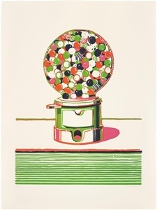
“Gumball Machine” color linoleum cut, 1970, 62.2 x 45.98 cm
“Shoe Rows” etching/engraving, 1979, 16.25 x 23.75 cm
“Park Place Study” oil and graphite on panel, 1992, 10.75 x 12.76 cm
“Two Jolly Cones” oil on board, 2002, 10.98 x .46 cm
“River Boats” oil and graphite on canvas, 1997, 11.81 x 17.72 cm
“Down Penn Street” oil on canvas, 1978, 47.99 x 35.98 cm
“Clown” color etching and aquatint, 1979, 45.4 x 60.7 cm
ROBERT TOWNSEND
“Cupcakes for Lia,” oil on panel, 2010, 26” x 26”
“Sweetheart,” watercolor, 48” x 48”
DAVID HOCKNEY
“Garrowby Hill,” oil on canvas, 1998, 60” x 76”